
OverTime Dashboard Automation Project
Background
The previous overtime analysis process relied entirely on Excel spreadsheets. This involved consolidating raw data from multiple departments, calculating overtime hours, costs, and employee counts, and then preparing summaries for cost centers and units. While functional, this manual process was slow, prone to errors, and lacked interactivity.
Project Objective
Develop and deploy an automated, interactive Overtime Dashboard to replace the manual Excel workflow, enabling stakeholders to instantly access real-time overtime analytics by cost center, unit, and department.
Key Features
1. Top-Level Metrics
Displayed as interactive KPI cards:
- Total Hours
- Total Amount
- Number of Employees
2. Cost Center–Wise Overtime Analysis
Horizontal bar chart showing overtime cost distribution across cost centers, with the top three being:
- Finishing
- Washing
- Stitching Other cost centers include Service, Cutting, Development, Quality, Embroidery, and Printing.
3. Unit–Wise Overtime Analysis
Bar chart ranking units by overtime expenditure, highlighting the top contributors and allowing drill-down to view department-specific data for each unit.
4. Department-Level Breakdown
Interactive tabs for Cutting, Finishing, Stitching, and Washing, each showing:
-
Cost center–wise overtime amounts within the department.
-
Visual comparisons (bar charts, pie charts) to assess departmental contribution to total overtime.
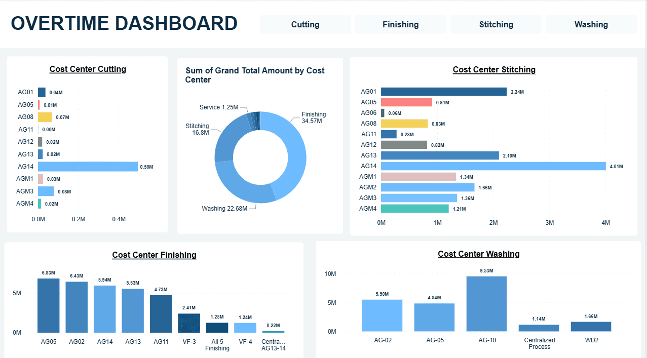
- Cutting – single high contributor among multiple small cost centers.
- Finishing – multiple units contributing significantly.
- Stitching – one major unit with several smaller contributors.
- Washing – one dominant cost center with a few secondary ones.
Workflow Before Automation
- Data Collection
- Export overtime logs from excel sheets receiving from mails.
- Retrieve employee master data with cost center and unit mapping.
- Data Cleaning
- Remove duplicates, correct cost center codes, standardize formats.
- Calculation
- Compute overtime hours and rates for normal days, Sundays, and holidays.
- Aggregation
- Use PivotTables to summarize overtime by cost center and unit.
- Visualization
- Manually generate bar and pie charts in Excel.
- Reporting
- Share the Excel report via email with stakeholders.
Workflow After Automation
- Automated Data Integration
- Directly importing data from excel sheets.
- Automated mapping to cost centers and units.
- Real-Time Calculations
- Instant computation of overtime hours and costs.
- Interactive Filtering
- One-click filtering by department, unit, or cost center.
- Dynamic Visualization
- Live-updating bar charts, pie charts, and KPI cards.
Benefits
- Time Savings – Reduced report preparation from hours to instant updates.
- Accuracy – Removed manual formula and entry errors.
- Transparency – Real-time access for authorized stakeholders.
- Decision Support – Quick identification of high overtime cost areas.